


Importance of font size in interface design
In this article, we at seobanda want to help you choose the right font, but above all, we want to share the secrets of successful graphics.


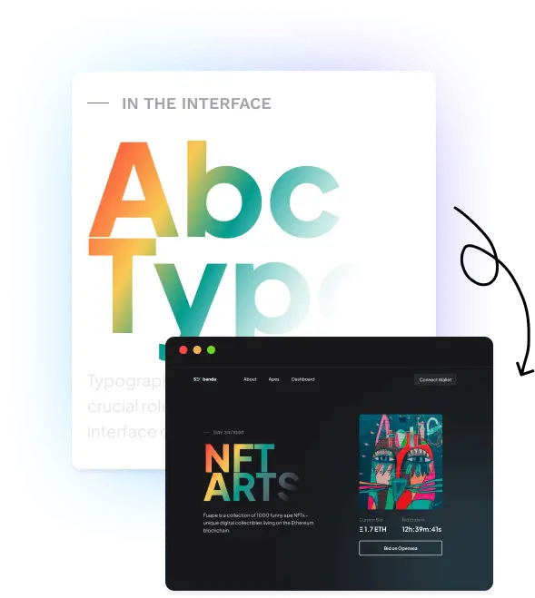


Typography in design
- Typography is the simplest form of user interface there is.
- Fonts are tools for conveying a message.
By combining them with weight, contrast, and other font families, you get the so-called visual hierarchy.
There are so many fonts to choose from that it can often seem overwhelming to decide which ones are right for your project.
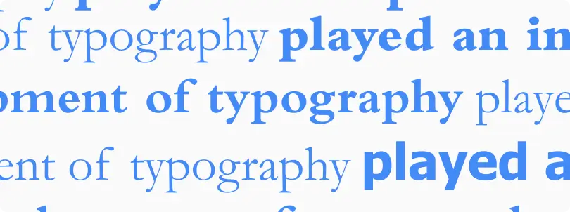
One of the surefire ways to ruin a design is to use too many fonts. As a general rule, sticking to one or two well-coordinated styles will produce the most cohesive and professional-looking results.
What is the difference between type font and font? What are the tools and criteria for choosing and creatively using fonts? What is Google Font and what is its advantage? Let’s explore the definitions and rules to discover the secrets of successful graphics for web pages and other projects.
History of the origin of fonts. How lead blocks became style icons
Symbols can be presented in many forms while remaining recognizable. These variants of the form are characterized by a particular style and correspond to what is now called the English term font, but which was originally defined in French as “fonte”, from the Latin verb “fundere” (to pour).
The reason for this origin soon becomes clear: typographic characters were once actually lead blocks with raised letters that, when fused together, formed individual words. Thus, the word “font”, which perhaps many believe was born together with digital technologies, has its beginnings in the 16th century.
Thus, a font is a certain style used to represent the characters of the alphabet.
Importance of fonts
Fonts are the visual form of the words we use and can dramatically change their meaning, or at least the reader’s perception of them.
A font, like any graphic element, conveys a message, evokes emotions, caresses the eye and directs it. Based on the chosen font, we can intrigue, entice, establish an empathetic contact with the name of the product on the packaging.
The choice of font can be important to achieve the following results:
- Readability or intelligibility of the message
- Positive perception of the message
- Memorizing the message

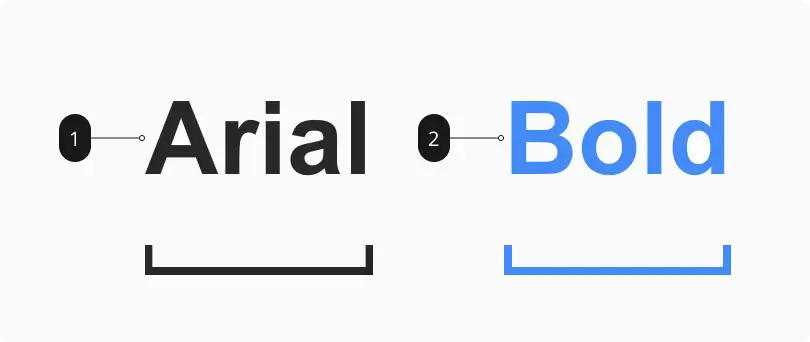
Font and its families: type font and typeface
- A typeface refers to a group of symbols, letters, and numbers that share the same design.
- For example: Garamond, Times and Arial.
- Font is a specific typeface style with a set width, size, and weight.
- For example: Arial is a typeface; 12pt Arial Bold
How to check the readability of the font
Some graphic designers offer a little trick to check the readability of a font. This is the so-called Il1 rule. It consists precisely in sequentially entering an uppercase letter (i), a lowercase letter (l) and a number (1), three characters that are easily confused. If the consistency doesn’t cause you any doubts, you can theoretically trust this font.
But the font is just one of the printing elements. Then you can work on color, size, spacing between characters, line spacing and composition, that is, on the dynamic relationship between different parts of the text and other graphic elements (photos, illustrations, etc.).

Types of fonts: from serif
to decorative variations
We talked about font families (typeface), but they are a subset of broader categories that are distinguished by:
Serif – Serif fonts contain serifs in each letter
Most recommended for print media. Includes subcategories: Old Style, Transitional, Neoclassical, Modern, Clarendon.
Sans Serif – without serifs
More suitable for the Internet and digital media. Which includes subcategories: Slab serif, Geometric, Grotesque, Humanist. the most popular are Helvetica, Frutiger, Optima and Futura.
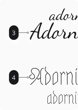
Calligraphy
Fonts in this category imitate handwriting, especially italics. When choosing these fonts, aesthetic judgment prevails and, at least it should, consistency with the message you want to convey. This category includes subcategories: Formal, Gothic, Calligraphic and Casual
Decorative
Use of these fonts is recommended only in exceptional editorial or advertising circumstances after careful evaluation of legibility and visual impact. The font should fit in with the overall graphic layout. With countless variations including: Stencil, Grungy, Inline
How and why to choose a font
Before scrolling through the available fonts, you need to clearly define their purpose: What do we want to achieve? What reaction do we want to evoke? In which graphic context will the text be inserted? What system of “values” do we want to rely on? What corporate or personal image do we intend to project?
Once you have clear enough answers to these questions, you can dive into the sea of available fonts.
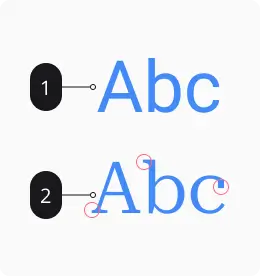
Importance of serifs: font Serif
What does a serif font mean? This means that at the ends of the letters there are “quotes”, or small branches, which give the letters a certain elegance and the text a sense of importance, classicity and seriousness. On the Internet, they are not very widely used for writing long texts, as they can cause readability problems (although there are sites made with only serifs, and they are beautiful), while they are very much appreciated in printed graphics. In fact, almost all books and newspapers are printed in serif fonts. However, on the Internet, they are very popular for creating headlines.
The most typical example is Times New Roman, created for The Times magazine, but you can find different variations in all printed books.
Sans Serif font: without serifs
Sans serif fonts dominate today’s web pages and screen-readable text in general.
It is a well-argued and widespread opinion that linear symbols without protrusions at the ends and without differences in thickness along curves are more legible and soothing for the eyes on the screen.
The most common names of this family are Verdana (born for the screen, not for paper), Arial, Helvetica, Futura, Din, All Round Gothic.
Custom fonts for people
with disabilities
What does a serif font mean? This means that at the ends of the letters there are “quotes”, or small branches, which give the letters a certain elegance and the text a sense of importance, classicity and seriousness. On the Internet, they are not very widely used for writing long texts, as they can cause readability problems (although there are sites made with only serifs, and they are beautiful), while they are very much appreciated in printed graphics. In fact, almost all books and newspapers are printed in serif fonts. However, on the Internet, they are very popular for creating headlines.
Among the most common fonts suitable for people with dyslexia are: Arial, Tahoma, Trebuchet, Open Sans, Helvetica, Comic Sans, Verdana, Century Gothic, Calibri.
Font Sources: Free or Paid?
As it is not surprising, fonts are intellectual products protected by copyright under intellectual and industrial property. The owner of the rights can choose to use them under so-called Creative Commons licenses, which allow the free use of his work in a more or less extended form and subject to certain conditions.
There are, for example, free fonts that cannot be used for commercial purposes (that is, for direct or indirect profit).
Desktop license
This is the case of the Desktop license, which usually distributes fonts that are available on a PC or through certain software. This license allows you to use it on your computer and for static images, but specifically for non-commercial purposes.
Webfont
Without prejudice to the above restrictions, the services accept licenses that allow free use of the product, even if, as in the case of Adobe, they require a subscription to the service, in this case related to the software developer’s programs.
There are online sources called Webfonts and are accompanied by online services such as Adobe typekit, Google Fonts, and MyFonts. In some cases, such as Google Fonts, available fonts can only be used on the Internet. This provision is also guaranteed by the fact that the font file is not downloaded locally to your computer, but a link is used in the site code.
Open source licenses
We often think that the term open source is synonymous with the word “free”, but this is only partly true. In fact, the term open source was coined to apply to software based on the sharing and reuse of source code. In the case of fonts, there is a special license called Open Font License SIL International. However, even in this case, attention should be paid to individual characteristics.
Text in space
Even when the text is processed graphically, it is necessary to evaluate its placement in space.
Hierarchy: Words Matter! (but not all are the same)
This may seem obvious, but the implementation of this in practice is not like this: on an advertising or editorial page, on a label or packaging, there are words that should reach the viewer first and possibly lead to others, according to a set hierarchical scale. Sometimes it can be an image that determines the type and size of the font so that the text always maintains the first visual impression.
A graphic designer must clearly know what the composition is focused on and what is the order of importance of other elements. In this way, it creates a perfect path that encourages the eye to dwell on points that are more important to the subject emitting the message.
A graphic project requires a balance between parts, and this also occurs in the manipulation and distribution of texts. You can use different types of visual balance, some of which are easier to master, others require an eye and visual culture above the norm:
- Symmetrical balance
- Asymmetric balance
- Radial balance
- Mosaic balance
Alignment in graphic design has the task of creating coherence and synergy in the visual structure and, above all, creates a pleasant connection even between disparate elements.
Repetition and texture
Repetition is the repeated use of the same or similar elements to create cohesion and allow the public to more easily navigate a design project.
Adhering to the principle of repetition means creating convenience and familiarity for the object, following the rules of the newly created context allows you to organize a lot of information and messages without cognitively overloading the recipient.
After choosing the right font, we can intervene with insightful creativity to better adapt it to our needs. Important parameters that can be influenced are:
- Dimensions
- Interlining
- Tracking
- Kerning
- Kegel
Alignment in graphic design has the task of creating coherence and synergy in the visual structure and, above all, creates a pleasant connection even between disparate elements.
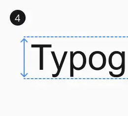
Tips for using font sizes
The correct size of the text is closely related to the concept of hierarchy mentioned above and, of course, to the balance in the overall composition. Care must be taken when forcing text size.
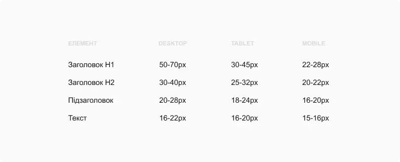
The table below shows the recommended font sizes for different electronic devices.
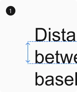
Interlining
Line spacing is the space between lines, the distance between the baselines of adjacent lines. In computer typesetting, this concept is usually called “line spacing”.
Spacing between lines should be chosen carefully, because it plays an important role in the readability of the text. A small lead can cause the top and bottom lines to visually merge, making it difficult to focus the eye. If the lines are too close to each other, it can prevent the reader from focusing and understanding the text. On the other hand, too much space between lines can make it difficult for the reader to find the continuation of the text, which will lose interest in the text.
A well-chosen line spacing facilitates the smooth movement of the eye from one line to another, which makes it easier to read and absorb the text. Optimum use of leading is an important factor in achieving balance, functionality and aesthetics in text design.

Recommended line spacing is between 120% and 160%.
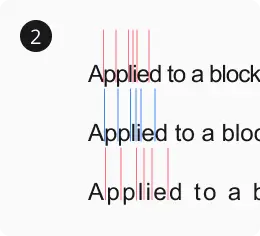
Tracking
Tracking is an interval in a group of letters. It can be narrowed and expanded, but even in this case it is necessary to pay attention to the needs of the view.
Sometimes you may need to adjust these settings to be able to fit text into a very tight space, or conversely to better fill a very large graphic space with a small amount of text. Utmost care is always required to avoid the effects of distortion that the human eye naturally tends to avoid or that cause mechanical disturbances.
Kerning
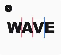
Kerning is the distance between individual letters, used mainly for 1-5 words in a headline or logo.
It must be taken into account that the standard spacing, which is not given much importance when we read the text of a novel or an article, can reveal some visual defects if the word is enlarged and draws all attention to itself as a graphic object.
Kegel
Kernel is the size of the font in a set, defined in points. A pin is the size of the area where the sign is placed.
Result
Fonts can be an important design element of your mobile or web app that can affect the user experience. Choosing the right font can help ensure text is readable, express the style and tone of your app, and improve its aesthetics. By following the guidelines and tips in this article, you will be able to create a more effective and attractive design for your mobile or web application.
You may also like it
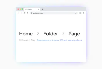
Breadcrumbs to improve SEO and user experience
Breadcrumbs are a navigation element on a web page that helps users understand their location on the site and makes it easier to return to previous sections. They...
HTTP status codes: What do they mean and why are they important for SEO?
HTTP status codes are short three-digit responses that a website server provides to a client's browser in response to a request. Each http response code has its own...
Logo for the website: How to create a cool logo?
A logo is the visual face of your brand. It creates the first impression of your business and influences its recognition. Try to think of the logos of Nova Poshta...